Visual Identity Refresh
My manager and I sat down one day, took a look at our then-logos, and came to the agreement that they were not cutting it. We felt that a couple of them were outdated (and quite frankly, simple). So, I spearheaded an ambitious visual identity refresh across all 8 of our radio stations and our main brand, Cromwell Media.
Since I'm the sole digital/design guy, this was a pretty lengthy process involving many, many revisions, lots of feedback from coworkers, and a sleep-deprived presentation to corporate (that I'm proud to say I nailed nonetheless).
Getting "back to our roots" was the motto for this project; we wanted to blend elements from our current logos with our vintage logos in a way that felt modern & fresh yet true to ourselves. We needed to make it clear that we were NOT changing into something completely new - just giving ourselves a bit of a makeover. But, fundamentally, these were still the stations that everyone knew and loved.
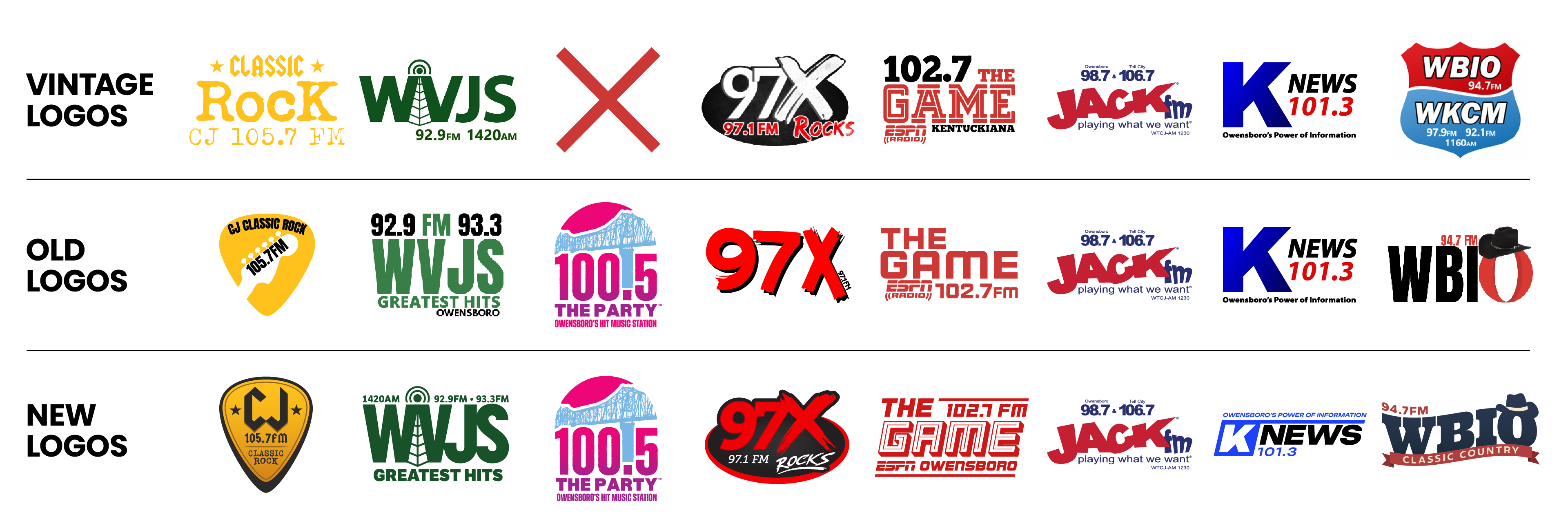
The main goal was to strengthen branding across the board while also strengthening our connection with our audiences. Showing a little upkeep with your branding is a great way to show that you're actively invested in your image, which in turn helps strengthen public perception.
Logo Redesign Announcement Video
Made with Adobe After Effects
Social Media Assets
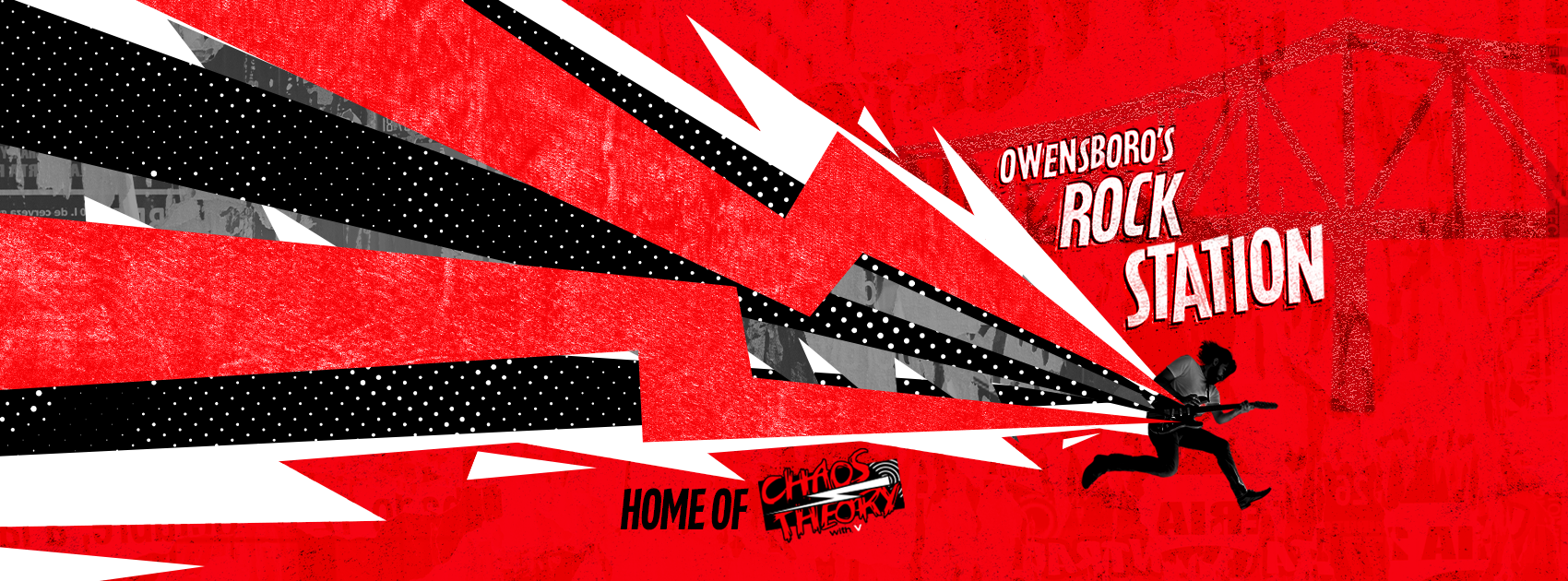
These are some of my favorite banner + PFP pairs I made for our stations' social media.
Website Redesign
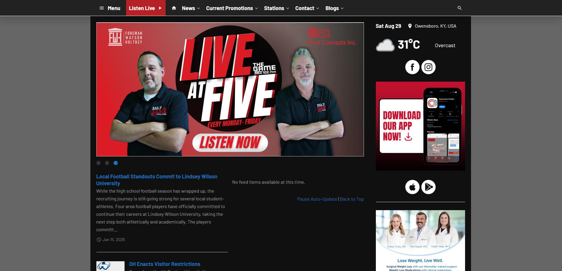
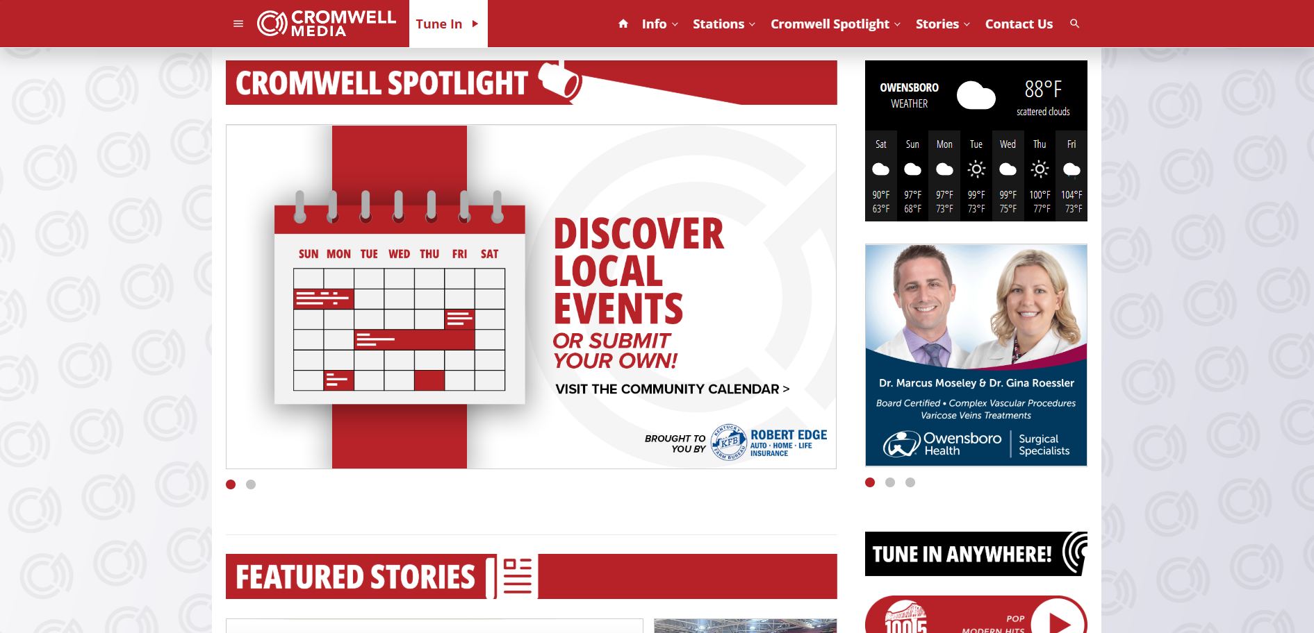
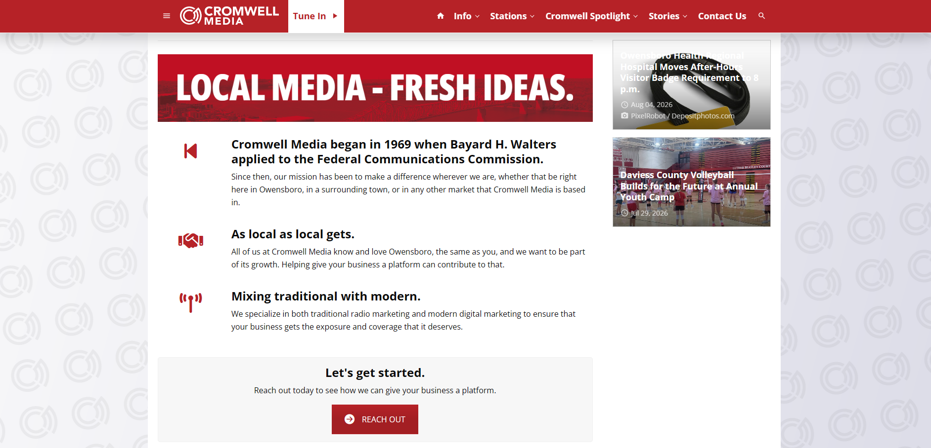
We use a website builder called SoCast, a service built on WordPress with radio in mind, for our websites. This website redesign followed shortly after the logo redesigns.
Old website homepage
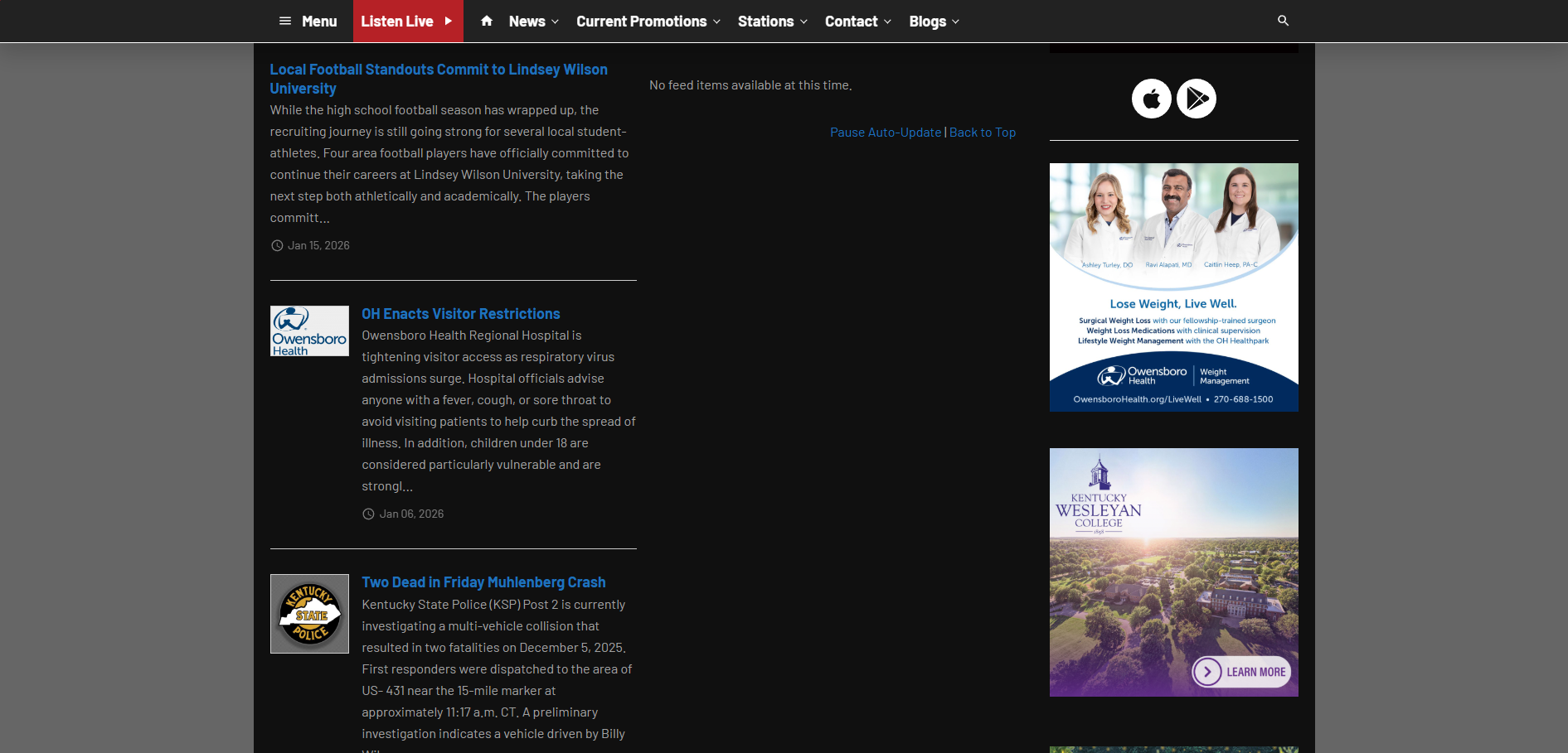
New website homepage
More Logos